Background
This project was a part of the Google UX certification program.
‘Sweet and Savoury’ is a hometown bakery and its app does not provide the facility of placing online orders. The app, however, has a detailed menu with a description of each item. We incentivized the users to use the app by providing special discounts exclusive to app users only.
The target audience, people who often shop at the bakery, will find this product very useful.
My Role
UI/UX designer designing the app from conception to delivery.
Responsibilities
- Branding
- Conducting usability studies
- Conducting interviews
- Accounting for accessibility
- Paper and digital wireframing
- Iterating on designs
- Low and high-fidelity prototyping
Problem
Since there is no online order-placing feature, users might not want to use the app.
Goal
To design a user-friendly app where users can avail of special discounts and see the menu and details about each product.
Framework Used
The framework used for this project was design thinking and all the steps (empathize, define, ideate, prototype, test) were followed.
User Research Summary
For this project, user interviews were conducted as part of the foundational research for a better understanding of users' needs. Interview results concluded that users wanted to use this app to plan out their future orders. This confirmed our initial assumption.
However, another user group was highlighted through the interviews. This user group found the app not so useful unless there were some incentives provided.
User (Research) Pain Points
No breadcrumbs
Budget limitation
Lack of details
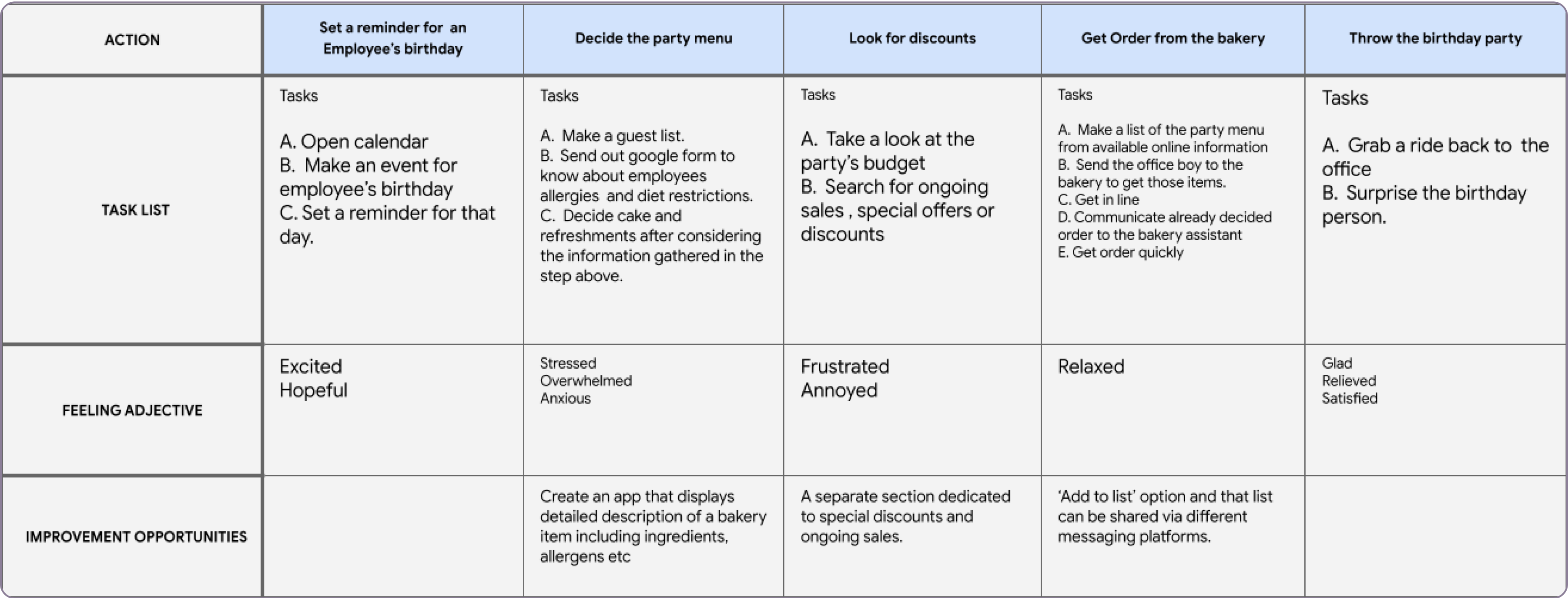
User Journey Map
GOAL: To avail of different discounts and special offers in order to plan budget-friendly birthday parties.
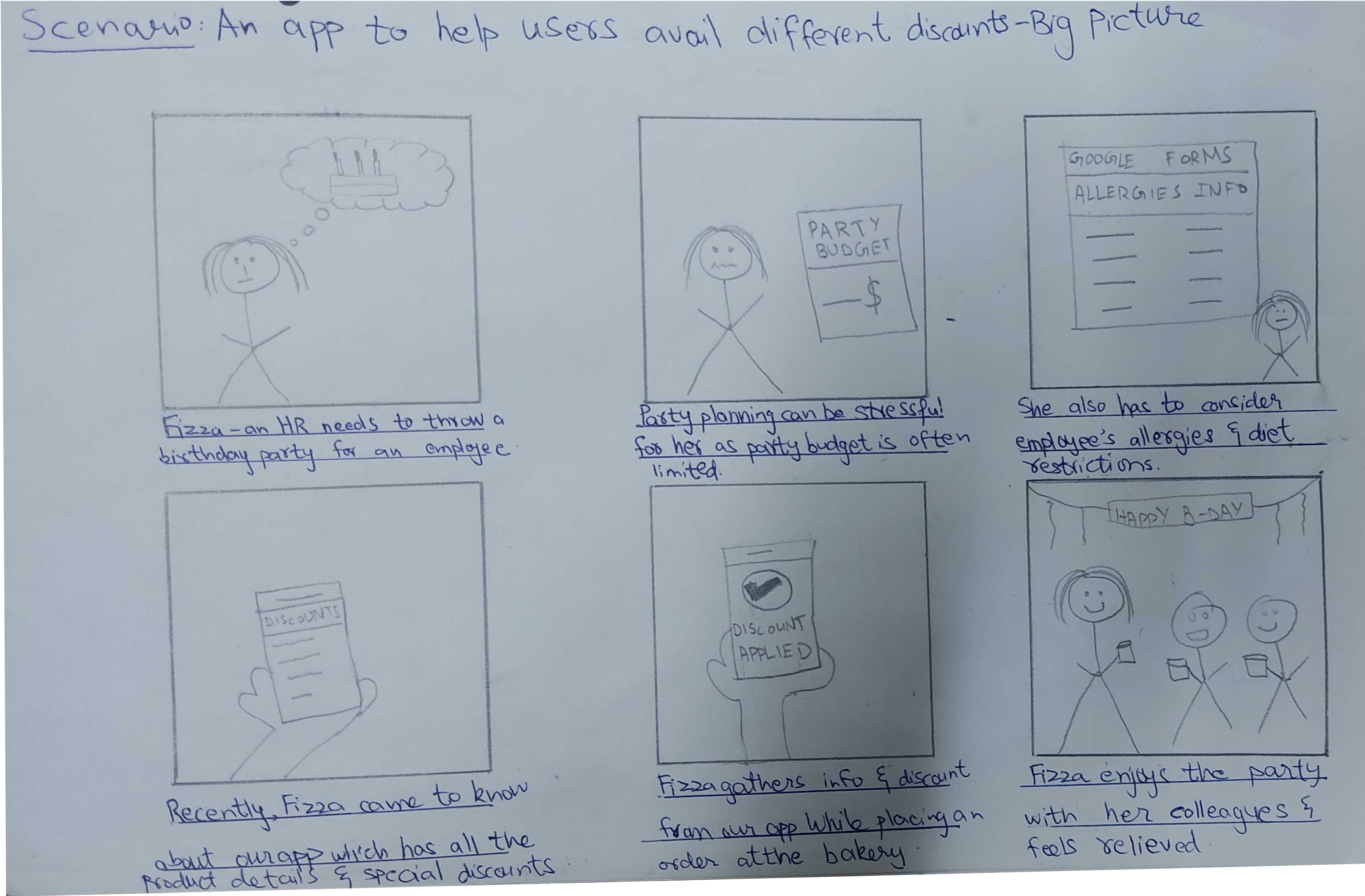
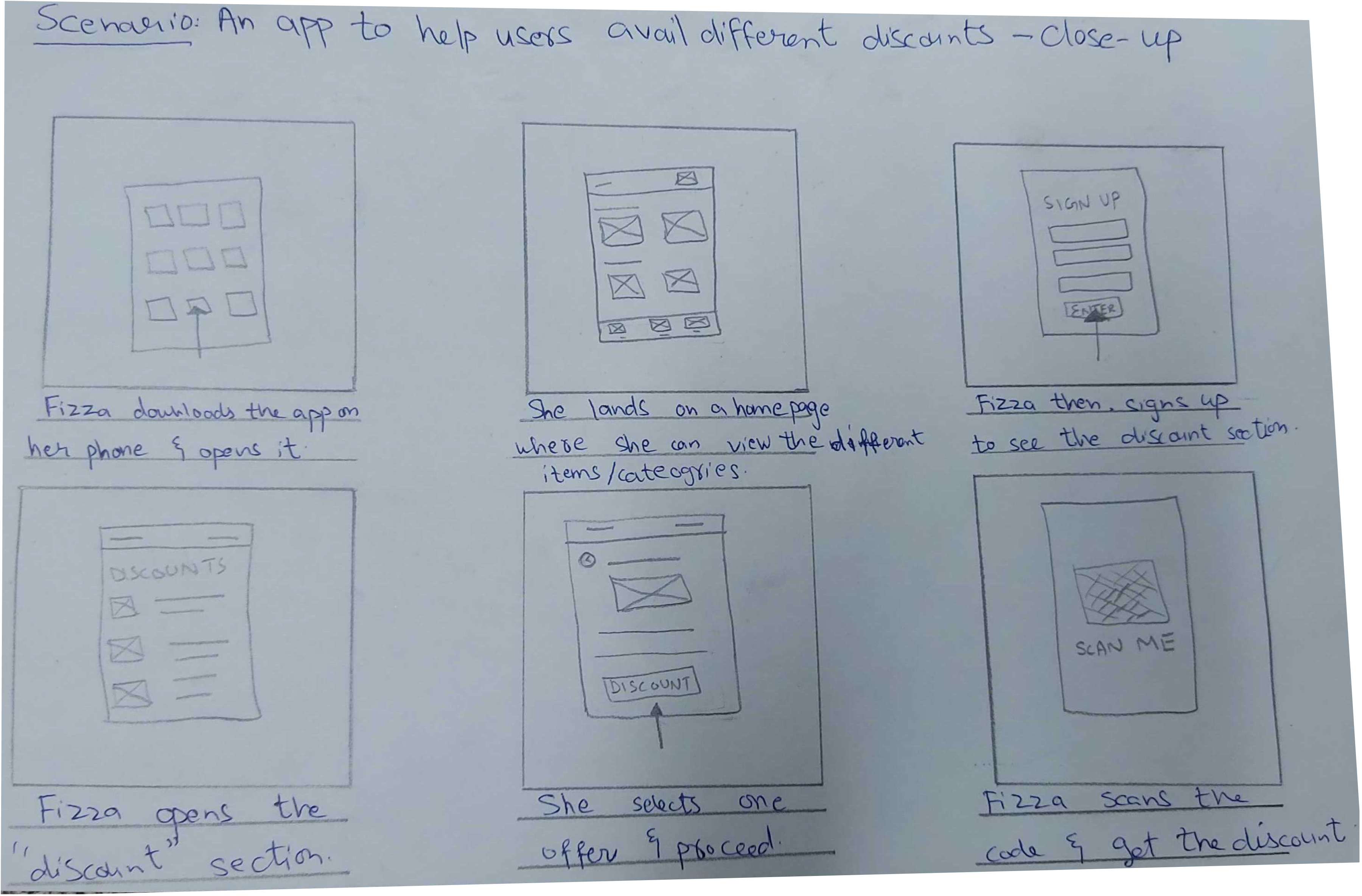
Storyboards
Both the close-up and big-picture storyboards were made to predict and explore the user's experience with a product.
Problem
Statement
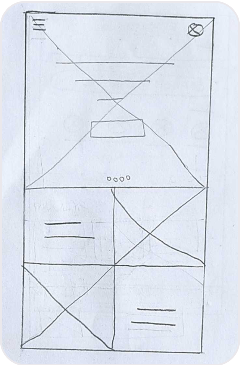
Paper Wireframes
Taking the time to draft iterations on paper ensured that the elements that made it to digital wireframes would be well-suited to address user pain points. For the home screen, I prioritized having discounts and the menu section at the front so it's easier for users to find it.
1
2
3
4

5
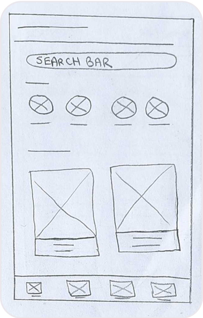
A total of 5 paper wireframes were sketched. Favorite elements from each wireframe were starred and then combined in one final wireframe.
Combined
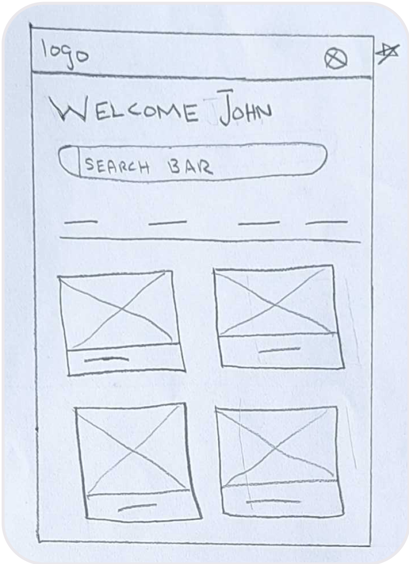
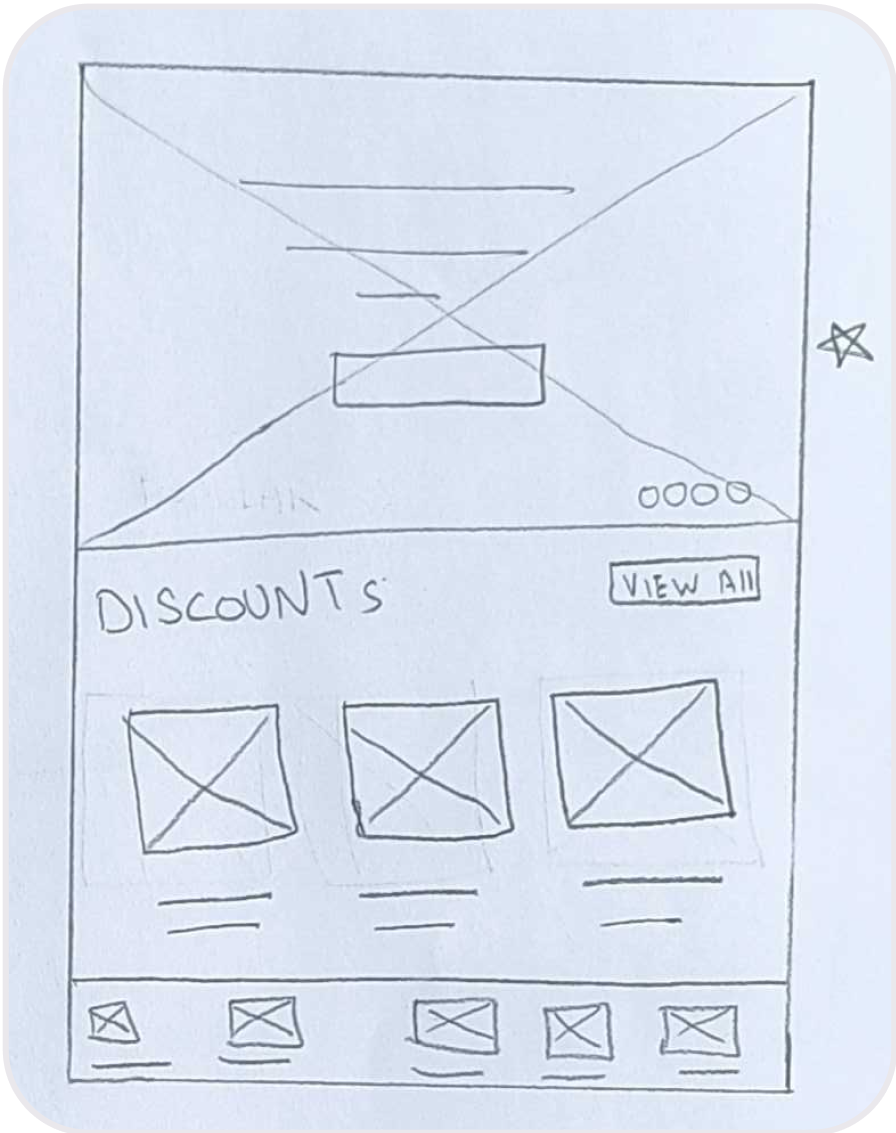
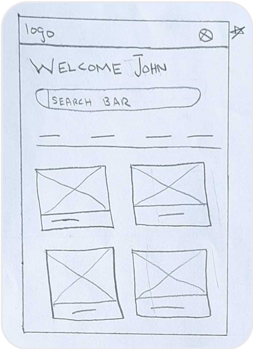
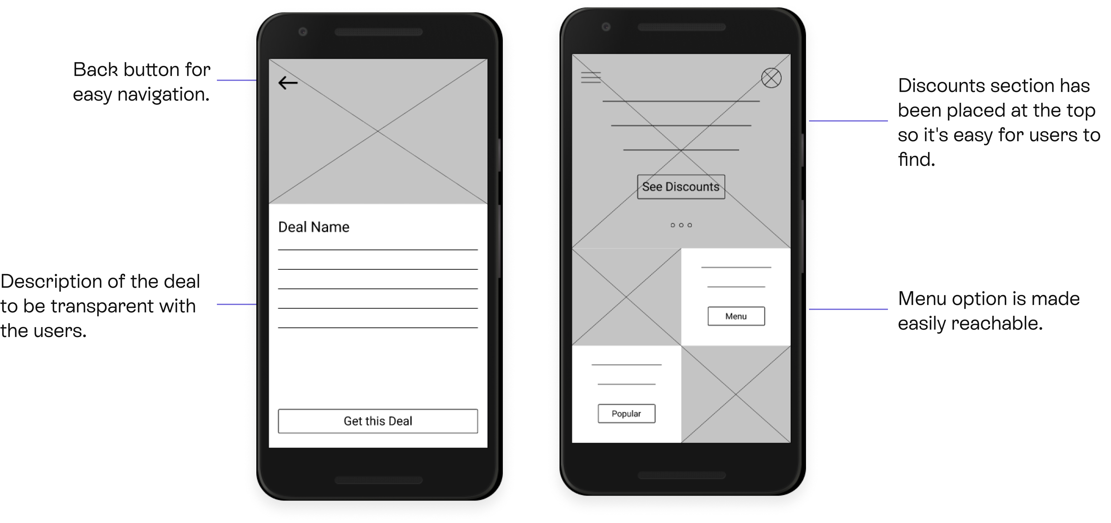
Digital Wireframes
As the initial design phase continued, I made sure to base screen designs on feedback and findings from user research.
Usability study: findings
I conducted two rounds of usability studies. Findings from the first study helped guide the designs from wireframes to mockups. The second study used a high-fidelity prototype and revealed what aspects of the mockups needed refining.
Round 1 findings
- Users found the process of availing of discounts hard.
- The menu was intuitive enough to find for most of the users but not all.
- The majority of the users were incentivized by the discount section, others needed to be educated about other potential benefits of the app.
Round 2 findings
- Users think that signing up should be at a different place (when availing of discounts).
- After signing up, the app must take users directly to the discounts section.
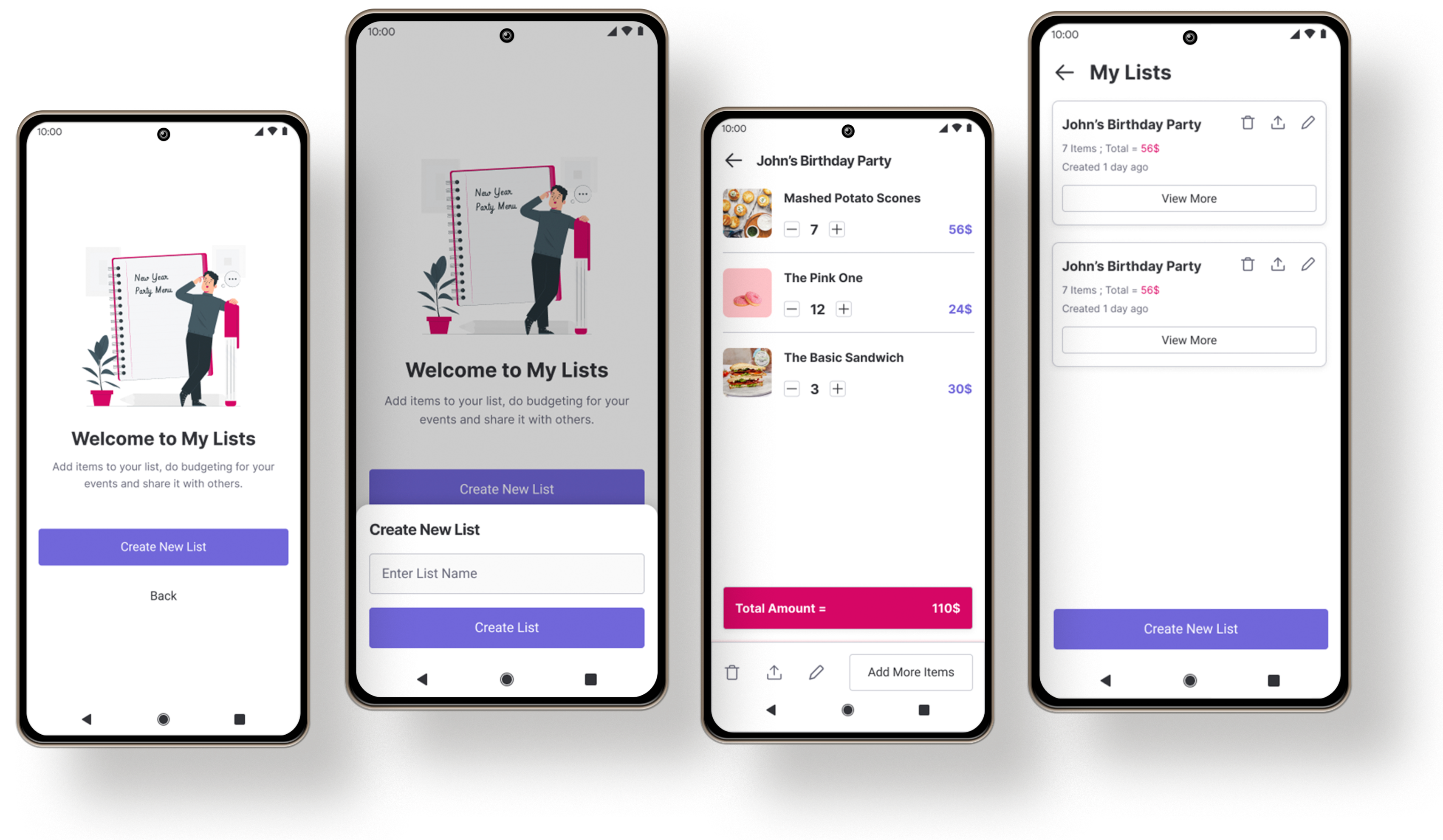
- ‘My list’ needs to be advocated in a better way.
Refining the Design
During the first usability study, it was discovered that users had difficulty availing of the discounts. Afterward, the problem was resolved by making the discounts section more prominent and easily accessible.
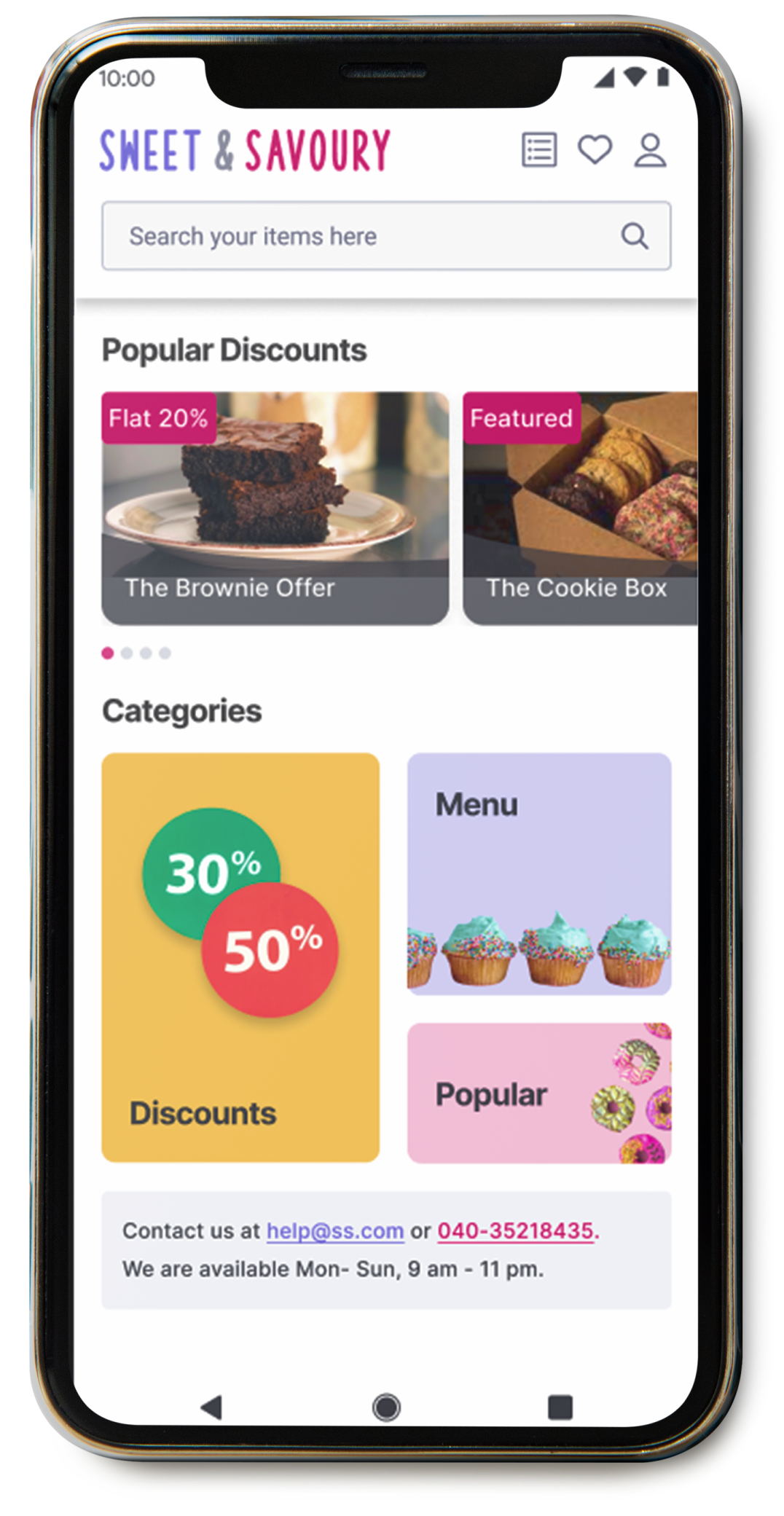
BEFORE
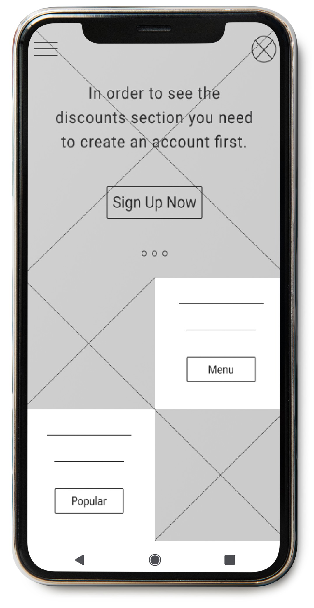
AFTER
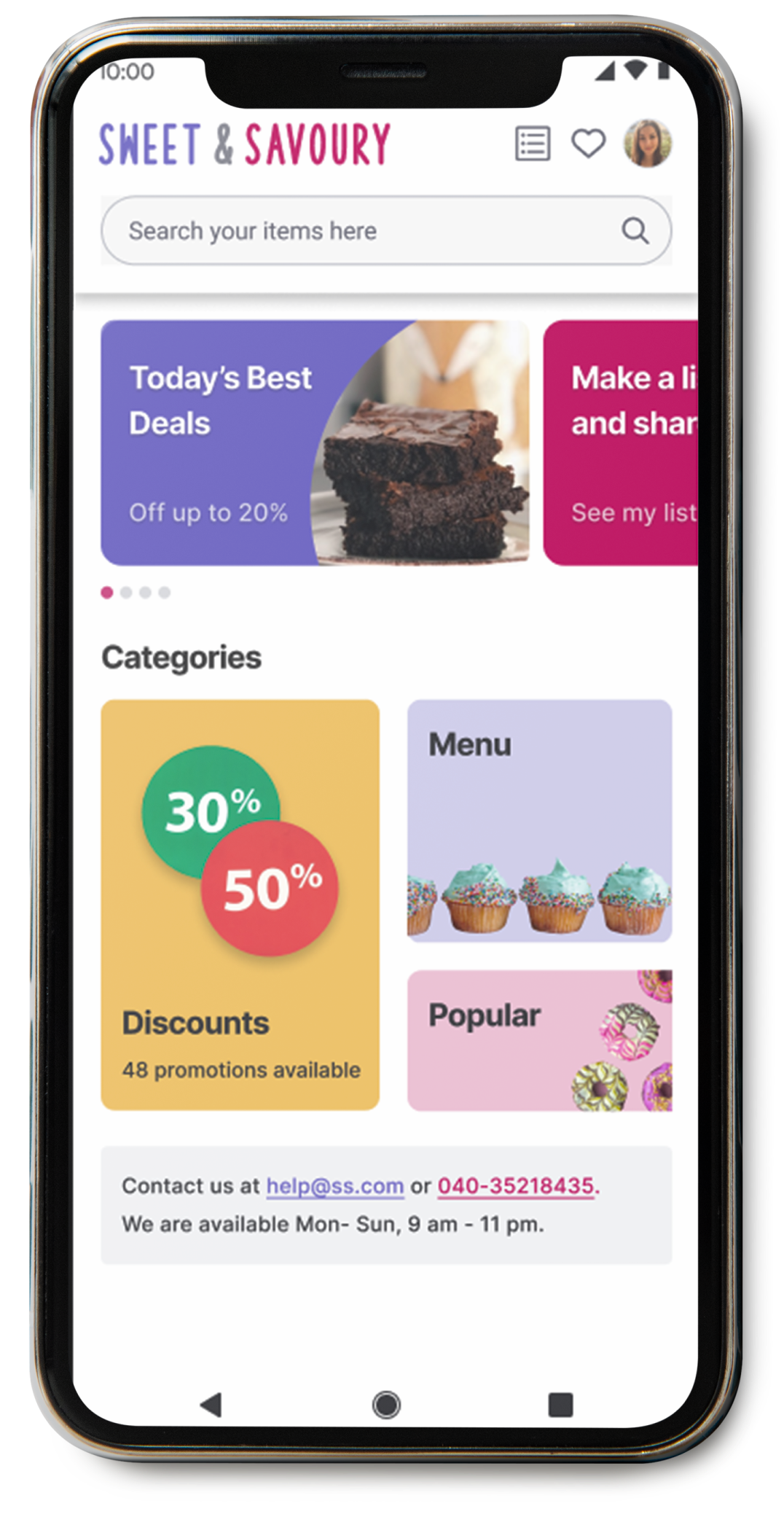
BEFORE

AFTER
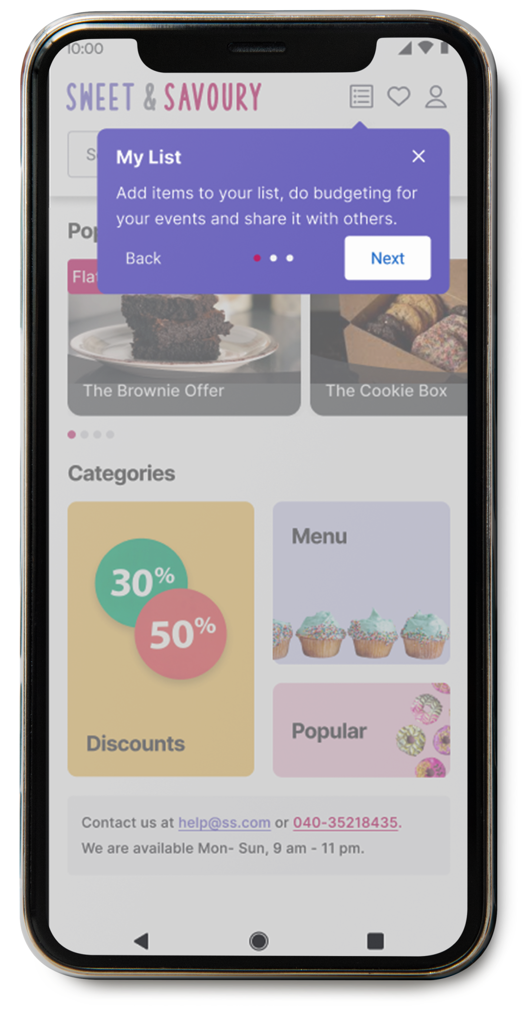
During the second study, it was also found that the users were confused about the feature ‘my list’. ‘My list’ allows the users to make a list and add items in it. This way they can know how much the total cost of all the items would be.
To educate users about this feature, a user guide was added at the beginning of the app.
BEFORE

AFTER
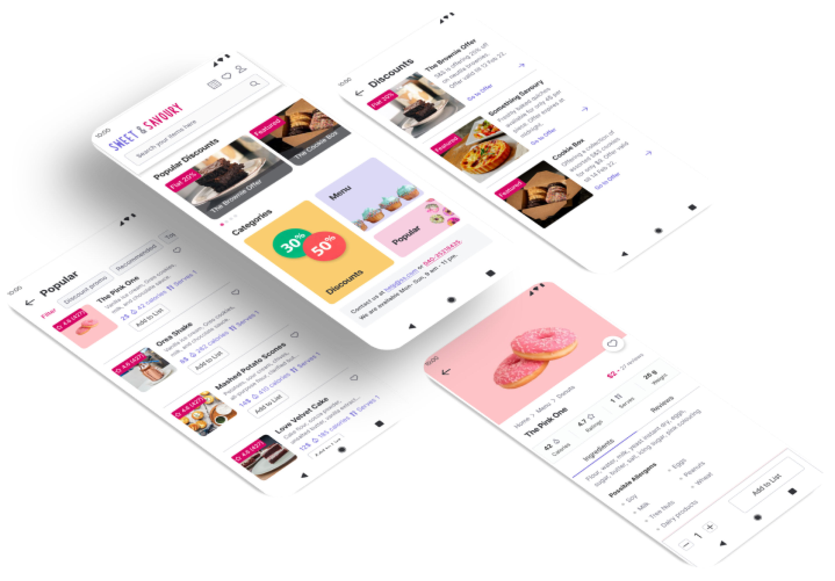
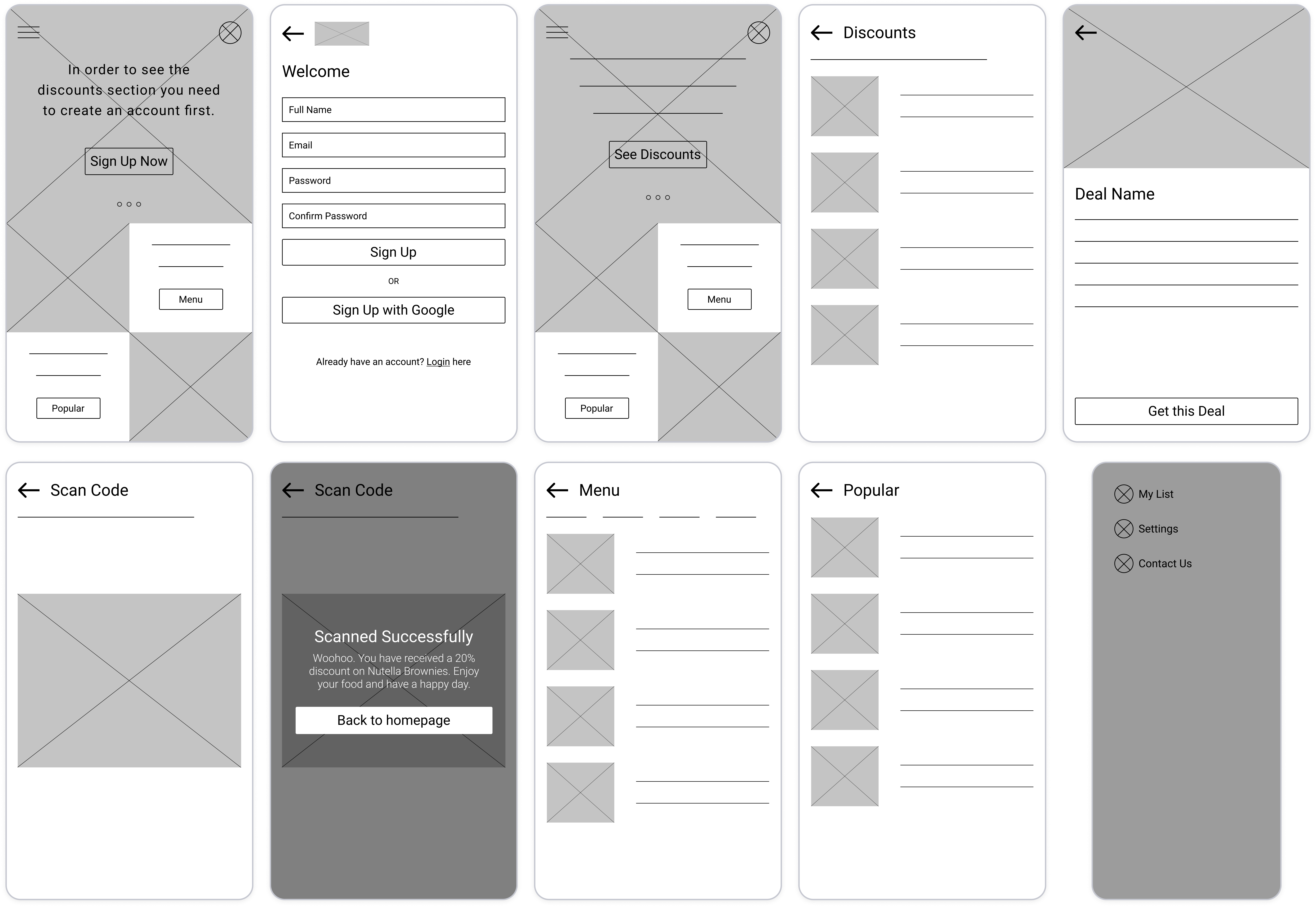
More Mockups
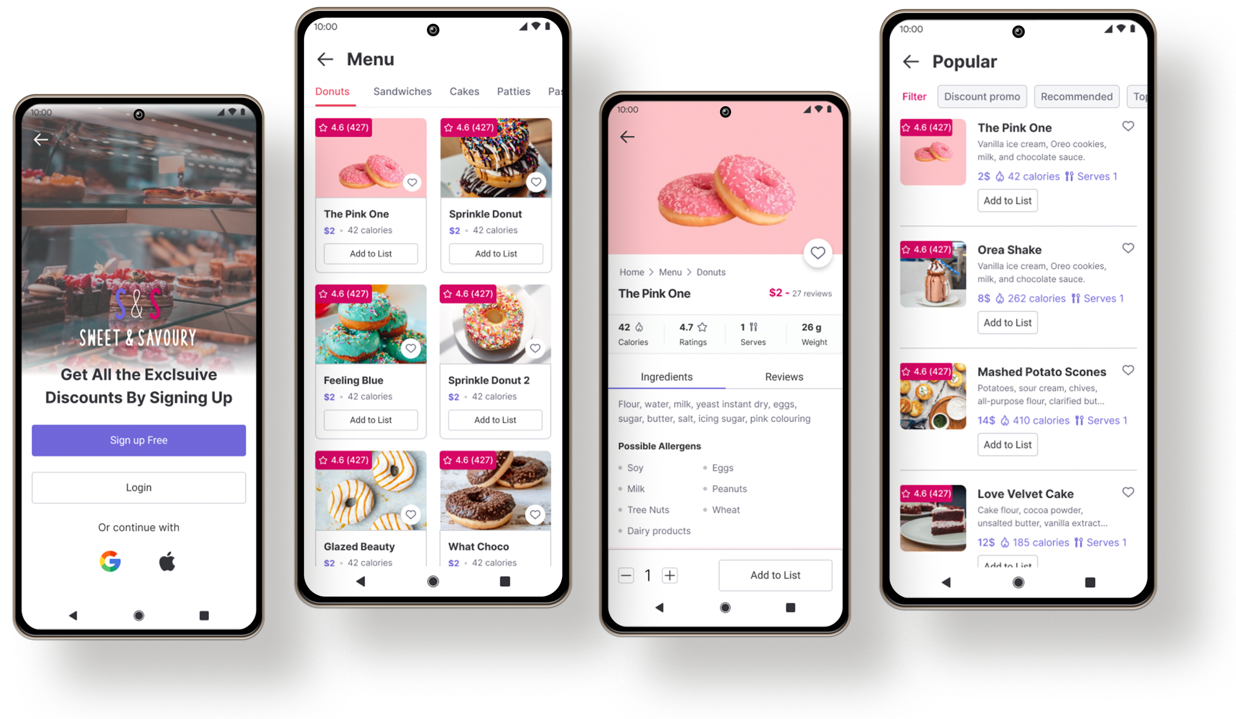
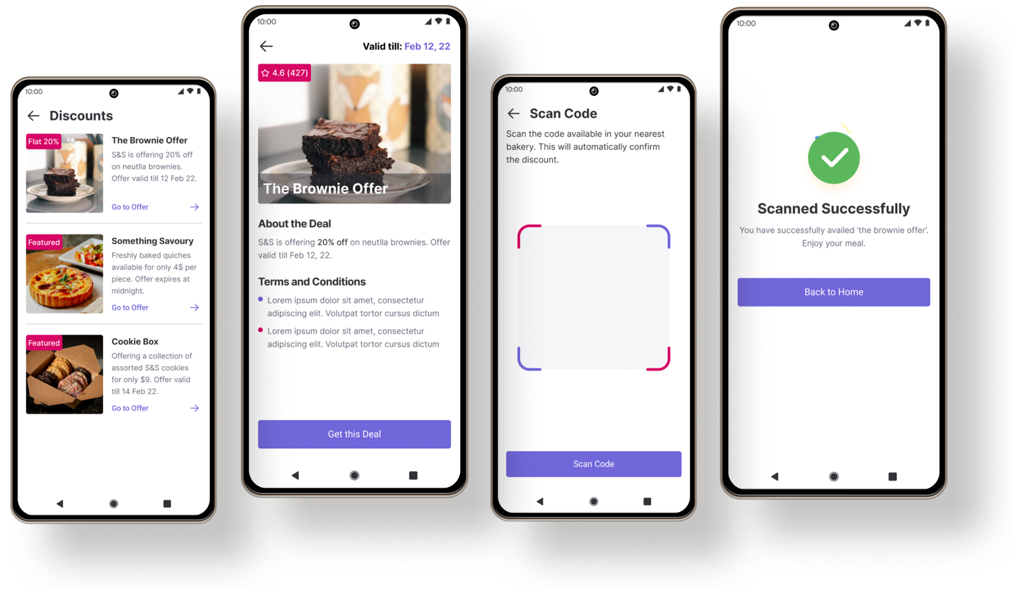
High-fidelity Prototype
The final hi-fi design and prototype presented a cleaner user flow for availing a discount. It also highlighted the importance of the feature ‘my list’.
Accessibility considerations
-
1
Color contrast ratio
Both the primary and secondary colors with hex value #7167DA and #D60665 passed the WCAG color contrast ratio.
-
2
Use of icons
Used icons to help make navigation easier.
-
3
Imagery
Used food imagery to help all users better understand the designs.
Impact
The app makes users feel like that Sweet and Savory really thinks about how to meet their needs.
What I learned?
While designing the Sweet and Savoury app, I learned that the first ideas for the app are only the beginning of the process. Usability studies and peer feedback influence each iteration of the designs.
What’s next?
- Conduct more user research to determine any new areas of need.
- Conduct another round of usability study to validate whether the pain points users experienced have been addressed effectively.